Archive for the ‘tech’ Category

Bus Countdown Clock

TransitClock1

I take a bus from home several days a week, commuting to work or heading out for the evening. Each time, I check my phone dozens of times to leave the house at just the right time and minimize waiting at the bus stop. Other times it would be nice to have a general idea well ahead of time; instead of waiting till I’m ready, check my Transit app, and finding out I just missed the bus and need to wait 40 minutes for the next one.

I bought a Raspberry PI Zero over the winter and had an idea to attach it to a small display and display departure times for each of my busses. Never wanting to reinvent the wheel, I searched for similar projects. I found this over-the-top LED matrix scroller over on Adafruit that would still take some work to use a cheaper graphical display instead. Then I found a much simpler solution: Phillip Burgess posted a followup Adafruit project that was just what I was looking for, the Personalized NextBus ESP8266 Transit Clock.

This made an excellent weekend project, I customized some of the Arduino code and display effects in less than an hour. It uses Adafruit’s amazingly affordable and simple Huzzah board with built-in WiFi to connect to my network and check bus times from NextBus. It then sends the remaining minutes to 7-segment LED displays with easy-to control I2C controllers. I printed a regular sheet of paper to label the buses (and also diffuse the LEDs), mounted everything into cardboard cutouts, and packed it into an Ikea 5×7″ Ribba frame.

TransitClock3


The thick frame can stand freely on a table or hang on a wall. The controller just plugs into any USB plug for power (or I can sneak a USB battery behind it). I think it turned out great!


TransitClock2


Now, if only someone would make an app for the Apple Watch that did the same thing, showing arrival times for several stops of my choosing.

One Week with the iPhone 6

20140921-164022

It’s been a week since I replaced my iPhone 5 with the new iPhone 6, and I’ve slowly been adjusting to the new experience. Of course with iOS there is not that much of a real experience change, but the slight jump in screen size feels much more significant. Aside from the sheer size, the design is also a big change, and I’m a bit disappointed. I loved the all-black anodizing of the 5 (which disappeared with the 5S), the squared edges, and the fine detail all the way down to the button machining. The new phone seems to throw out the signature Apple attention to detail with boring rounded edges and buttons, mismatched silver case, and blatant out of place plastic seams. I really don’t think Jobs would have let this slide.
Of course most people will just hide it all under a case. I prefer more minimal protection, and I’m anxiously awaiting iPhone 6 updates for corner Bumperz and the awesome Wally wallet that I loved on my 5. Maybe I’ll get some colored bumper around the edges just to add a bit of style to the sea of black. As for the size…after a week, it still feels huge. However looking back at others’ iPhones, they now immediately seem tiny! I’m sure I’ll continue to get used to it.
I’ve been trying to learn the new Swype and Swiftkey keyboards that Android has had for years. It’s mostly frustrating as my finger is faster than my brain so every other word is a mistake, and overall it’s much slower than my very fast touch typing on the standard keyboard. We’ll see if I improve with time or give up. Another disappointing Android addition is widgets. They aren’t on the lock screen. You have to intentionally remember to swipe to see them. So they’re useless.

20140926-235347

An unexpected feature I never though I would care about is the built-in pedometer functionality. I’ve actually been checking several times a day, often shocked at how many steps my poor feet actually take, walking far further each day than I ever imagined. No wonder my shoes never last that long! I’m also enjoying TouchID; I never locked my phone as I can’t stand having to enter a password just to glance at my most-used gadget. Press & hold for a second is just as simple and non-intrusive as press and swipe.
The camera is very important to me as it is the camera that is always on me and therefore used in a lot of situations. Apple’s upgraded camera app is much more useful than before with some added exposure control. But after a few days my favorite replacement app ProCamera was updated and added the full manual control capabilities added by iOS8 to its already advanced control features that I love. Having 240fps slow motion HD video in my pocket is also awesome, not just for filming crazy dogs, but also quickly viewing LED light flicker. It’s beyond the capability of all my real cameras!
Last but perhaps most significantly, the battery life is a shocking improvement. While my 5 was down to about 60% in the afternoon of a usual work day, the 6 is around 90%. The battery doesn’t have much more capacity, so it’s really a statement to the significant bump in power and technology of the new processor.
There’s more to come soon, and I can’t wait to start using Apple Pay in a month or so, but the one thing that I’m really excited for to complete my new iPhone experience is the Apple Watch. I’ve been a fan of geeky and stylish watches all my life, and my experiment with the MetaWatch over the past year proves just how much I love having notifications and other info at a quick glance. I miss it repeatedly on the days I wear a normal watch. The Apple Watch should add a ton more functionality and innovation, and I’ll be first in line to get one!

A New Camera System

a7a

Two months ago, I did the unthinkable: I sold off all my Canon gear, and replaced my aging T2i with a Sony A7. Not long before, I was strongly rooted in Canon and never considered Sony a real SLR player. After my usual extensive research I realized Sony truly changed the game with the a7, and I managed to get a significant increase in photo quality, smaller size, more modern features, plus a jump up to full frame sensor for almost no cost at all!


I intended to update from my T2i years ago, but Canon had not improved the quality of its APS-C sensor over the last several generations. I had long outgrown it and was ready to step up at least to a 70D for newer features, but the cost stayed high and I knew quality was not taking a significant step, so I kept waiting. Meanwhile, Sony had been making impressive sensor quality advancements over the last several years, the reason behind Nikon’s recent leapfrog over Canon’s quality and sensor advancement. Sony’s NEX series was not quite serious enough for me though. Then here comes this new a7 with full high-end SLR quality, modern features, and astonishingly a full-frame sensor crammed in a small mirrorless body.

a7b


Many years ago I was one of the first to jump on the retro mirrorless bandwagon with the Olympus EP-1. I loved the look and feel of the camera, more portable size, and its ability to use Leica/Voightlander lenses with a simple adapter. Unfortunately I did not use it much, as I gravitated to the Canon SLR for the significant quality difference of the larger sensor and increased shooting speed. Mirrorless has come a long way since then, but until now sensor size has been much smaller. I had always been happy with APS-C, liking the smaller camera and lens size, and significant price difference vs. full-frame. But with the a7, Sony turned all of this on its head and crammed a full size sensor in a small mirrorless body, at an APS-C price point. Just look at the significant different in sensor and body size between the a7 and the T2i:

a7c


I managed to get some good deals on used equipment, and for about the same as wheat I sold all my canon gear for, I have a roughly equivalent system. One of the best features is the ability to mount almost every lens every made with cheap adapters. Pictured (at top) on the camera is the Voightlander Nokton 40mm f1.4 for Leica M. Compare that tiny lens to the nearly similar Sigma 50mm f1.4 EX for Sony Alpha on the left (when I need high speed autofocus for). On the far right is an old 18-28mm wide lens from my mother’s Minolta SLR. In addition to the 28-70 kit lens, I also have the Sony 85mm f2.8, and the pocket change Samyang 500mm f2.8 mirror lens. The smallest lens pictured is the only non full-frame lens, the super compact EPZ 16-50 for Sony NEX, which does crop the resolution but is super portable. I can gradually replace these with native full frame FE lenses as they are released.

A Few Weeks With A Smartwatch

20131126-212200.jpg

For the past year, I’ve noticed more and more moments that I wish I had a smart watch. I have followed MetaWatch and Pebble from their inceptions but always held off to see how well they really worked. Initial reviews showed they had limited features and poor integration, and rumors have been flying for months that Apple has it’s own iWatch on the way that would certainly do a better job.

After this fall’s set of Apple announcements failed to produce a watch (and I think I know why), I finally decided to give in. I decided to go with a used watch off eBay to save some money, especially in case Apple surprised us sooner than later. While Pebble is the more popular pick with its endlessly interchangeable watch faces, I went with a MetaWatch Frame, and so far I have been mostly happy with it.

I want a watch to simply be a notification extension for my phone. With a quick glance while walking, driving, or during a meeting, I can easily see if I just received an important email or just some status update. Important news alert or spam. Event reminder or text message. I don’t need or want it to do much else, and certainly don’t want battery life wasted to do the extra bells and whistles. While the Pebble only supported email (with its own mail client), Metawatch sent me an email months ago saying it supported ALL notification center alerts immediately with iOS 7, and it does so perfectly. Furthermore, the Frame is a much nicer metal with glass, not plastic case and screen like the others. It is also the thinnest, and lasts more the five days on a charge.

In fact I find I no longer miss calls and messages because while I sometimes don’t feel the phone vibrating, there is no missing the watch buzzing on my wrist. It’s not rude to quickly glance at your watch during a conversation or meeting. And frankly I love the classic low-res screen with perfect pixel fonts and Susan Kare icons. While there are many choices for layout positions, unfortunately they only offer the one watch face.

20131126-214632.jpg

But I think I know why Apple hasn’t announced a watch yet. Everyone thinks it’s the watch’s limited battery life. That’s not a problem at all, and apple conquered that long ago with he iPod shuffle. No, the problem is the iPhone’s battery life! Despite using Bluetooth Low Energy, the phone is down 50% by mid-afternoon on a work day, where it might normally be at 85%. Not a problem during normal days when I can top it off, but no good for those longer days or traveling.

So I love the watch for workdays and my usual schedules, but there are plenty of improvements needed. I still think Apple will appease us geeks with a more perfect watch sooner or later, and I’ll be first in line for it.

Google Reader, R.I.P.

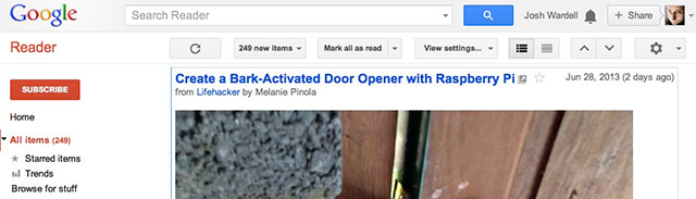
It was very sad this morning to see my most-used corner of the internet shut down. For many years, Google Reader delivered all of my web sites—all my news, information, and most knowledge—in a single steady stream. While there are many similar alternatives now, nothing quite duplicates it just yet.

reader1

Many years ago I used to visit many websites, each several times a day. Sites that would regularly post new content in short articles. Yes, blogs, but in a broader sense any news site, even forums. An incredible amount of time was wasted repeatedly checking, finding nothing new or worse figuring out where I left off to then catch up. These sites (as well as this site) all offered a way to subscribe to an RSS feed of this information. Desktop clients existed to do something with this, but rarely am I sitting on my computer at home reading. Google Reader did a spectacular yet simple job of gathering it all together and allowing me to access it—right where I left off—from anywhere.


readeripad

The way I used Reader was not exactly their target, and is a big part of why many of the alternatives don’t work for me. I really wanted everything in one feed; I do not just pick the site or category I’m in the mood for and read a bit. So my configuration was essentially Unread articles from All Sites, Full articles displayed, in Reverse chronological order. I could pull it up on any computer, it would open where I left off, then I could just hit the J key to move down the list as I quickly read. The other side of things was thanks to the excellent 3rd party Reeder app on my iPad, I could download this huge feed and read it from anywhere, even without an internet connection. It would keep track and catch up later. 


Thankfully we had a few months warning of Google’s unfathomable decision. Many folks stepped in to make alternatives. Unfortunately, none of them are really complete. I gave them as much time as possible than in the last few days signed up for them ALL, even created a spreadsheet to evaluate the features. You can find a list of alternatives anywhere, but I’ll narrow things down to what I think works best for me.


First, and last, is Feedly. I don’t like it. They have differing opinions on interface and you have to work a bit to get it to work MY way. But it does work, and technically checks all the boxes. Most importantly, it is the ONLY solution with iPad apps with offline caching including Byline. This is how I used Google Reader most of the time, so despite my distaste it is my final choice, until something else presents itself.


The Old Reader is my top vote for a true replacement. No doubt because they target to almost copy Google Reader exactly, and even bring back some of its sorely missed sharing features. Unfortunately there is no app support yet. “Coming Soon.”  Similarly I also like NewsBlur, which is a bit more advanced. Digg has also made a nice effort.


The Greatest Potential award goes to AOL Reader. Their beta reader invite showed up just before midnight on July 1st. It is simple, clean, enjoyable, and works well. Right now there’s no app support. But unlike all the others, there’s a big company with money standing behind it. A company that is tired of being behind the times and laughed at. They stand to gain a lot if they continue to flush AOL Reader out and have the resources to make great apps as well. Only time will tell.


I just wish this was all a big joke from Google. Reader had millions of devoted users, and Google of all companies should have been able to find a way to make such a decent web app successful. My usage stats over the last few years went well over their 300,000 articles-read cap and I see no sign of slowing down.


readerend

Generations of Light

20130306-192903

We’re getting closer and closer to a decent replacement to the 172-year-old incandescent light bulb! Clockwise from right is a 60 Watt incandescent, a 14 Watt non-dimmable compact fluorescent, Philips 12.5 Watt AmbientLED (2011), and Phillips’ newest 11 Watt Energy Saving LED (all 2700K “Warm White”). What you are seeing is not only an improvement in power efficiency, but also in quality of output that gets closer to original incandescent. Affordability is improving as well, as I just picked up the new Phillips at Home Depot for $13.

Phillips still leads the pack with its more expensive L-Prize Bulb (10 Watt, 940 Lumen, 92 CRI), the new more affordable (and all-white) Energy Saving bulb (11 Watt, 830 Lumen, 80 CRI), and the year-old AmbientLED (12.5 Watt, 800 Lumen, 80 CRI). The new model hides the yellow so it looks better if not hidden in a fixture; it also turns on faster and dims lower than the AmbientLED.

Others are playing catchup; Cree will soon have a 9.5 Watt 800 Lumen 80 CRI bulb it claims will also sell for $13…check out creebulb.com. LEDs Magazine also had a recent article of what’s out there.

Update: Watch my video comparison of the new Philips and Cree bulbs here!

In addition to a challenging power supply design that can not only continue to provide DC voltage when significantly dimmed, but also duplicate that dimming on its output, the real challenge is creating a warm glow in a full sphere from a point source of cold light. White LEDs are actually purplish blue and then coated on the die with a phosphor that glows and converts that energy to multiple colors in the white spectrum, much like an old tube television converts its cathode ray to glowing points of light. What Phillips has done is separate that phosphor and place it remotely on the outside of the bulb (the new bulb still has a dome in the middle), and as a result the AmbiLED bulb looks yellow when off. Now the light is being produced by the phosphor around the outside of the bulb and has a nice even spread.

Anyway the real reason for this babbling is to show you what one of these looks like when taken apart and powered! The royal blue LEDs bathe the room in nothing but blue light, but the phosphor petals glow yellowish white on their own, even some distance from the LEDs:

20130306-232226